Showing posts with label OUAN405. Show all posts

Monday, 13 March 2017

25 Second Animation - Finishing it (OUAN405)

Woo I finished my animation. Only now I've watched it a million times over I hate it and I hate the colour scheme and I hate the animation and I hate the sound mixing. But I SUPPOSE that is the way of animation. The moment you finish something and watch it a billion times you think it SUCKS.

I was delayed in the finishing of the animation because I had all the clips lined up in a line and it looked well good, and then my tutor said "it would be funnier if there was more blood" so I was like "UUUUURGH" and then I went back over some of the clips to add more blood. I'm glad I did because I really like the effect, but I think some parts look a little slap-dash.


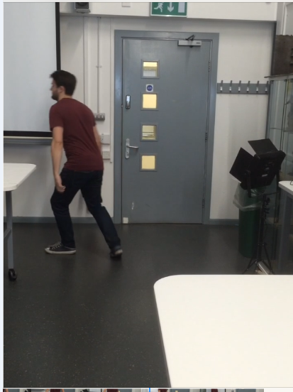
The blood pools underneath every footstep
I'm pleased with the sound mixing in general. The most important part for me was making sure that the car crash sound was really exaggerated and cathartic, because without it the contact looks a tad lacklustre.

I was quite pleased with the soundscape from my animatic, so I reused quite a bit of it. I added some smooooooth jazz drums to the opening shot, which I think quickens the pace and adds more character.

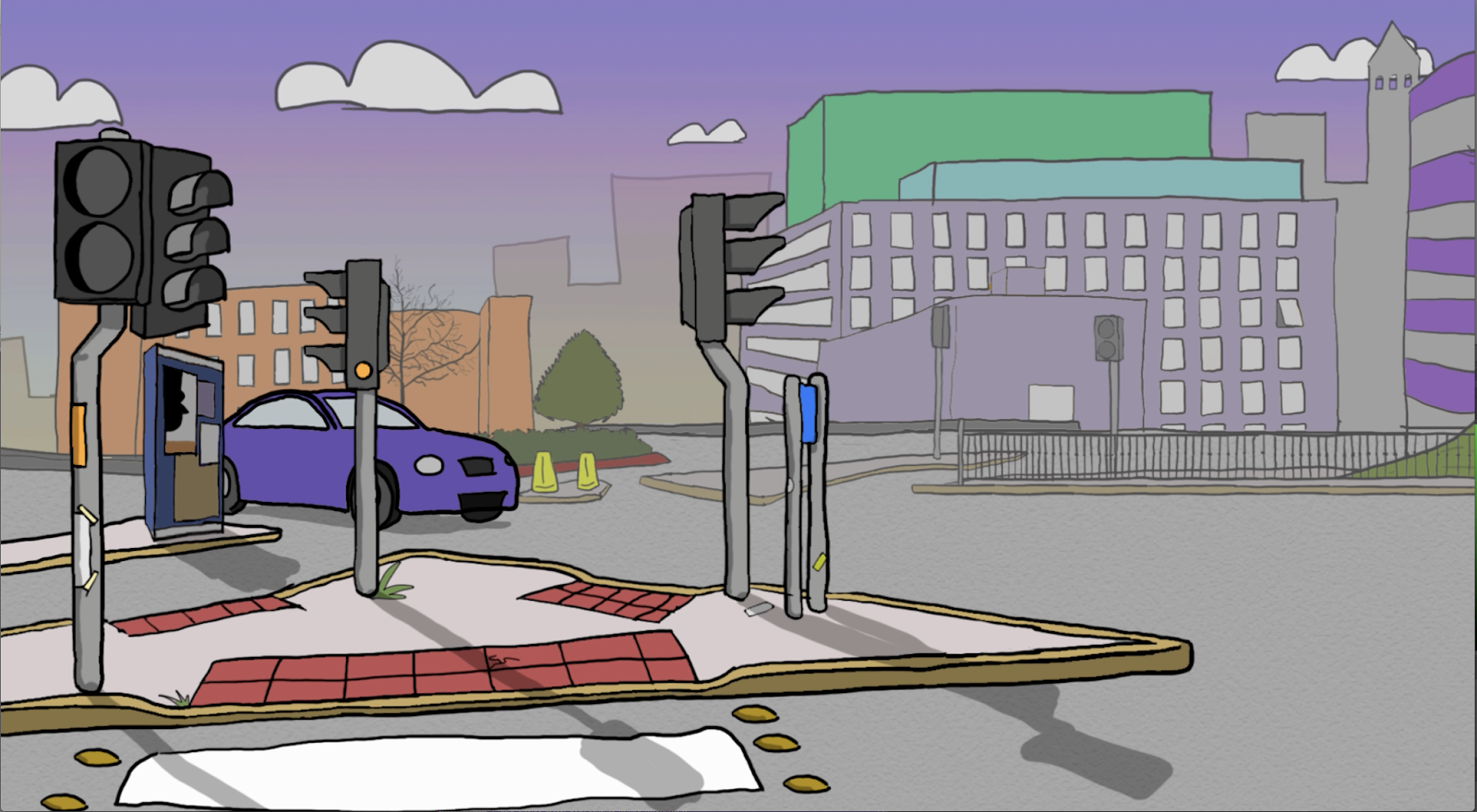
I'm most pleased with the character animation, especially certain parts of the crossing signal dancing. The backgrounds are certainly a step up from my previous projects in terms of their complexity, but in future I'm very keen to try some more textures and fine details to make the world more real-feeling. At one point I considered animating some background characters. I now regret not doing that because it wouldn't have taken too long and it would've looked nice, but honestly I sort of forgot to.

The opening shot is nice, but the frame rate really vexes me because the camera pan looks a little jolty and I am not sure why.

Finally, I feel like certain parts of the sound scape play a little too quietly in conjunction with other parts of the animation. For instance, I may go back and edit it so that the background traffic noise is a little louder and the jazz music is a little quieter, but it is not a huge issue. Besides, the loud and quiet contrast adds to the effect of switching abruptly between the worlds of the humans and the crossing signal men.

Sunday, 12 March 2017

25 Second Animation - Animating From Reference and Animating Some More Shots (OUAN405)

Normally, walk cycles are rather easy. A drunk, blind chimp could animate one.

At least, it's easy to draw a walk cycle along a two dimensional plain. Sometimes I just wish I lived in the world of 1960s Scooby Doo because everything exists on a 2D plain and life is simpler


I also want to live in the world of Scooby Doo so I could commit hilarious crimes.

Literally me af
But SOMETIMES I have to draw a walk cycle from a weird angle or something. And for those drawings I have learned to use REFERENCE for the first time.


For the shot where the man walks across the road, I filmed my coursemate AND REGULAR MATE (I hope) Alex, walking. I didn't rotoscope it but the footage was really handy for reference.


Later on, when I needed a shot of the same character hobbling across a street, I waited for Alex to come into the studio before hobbling him with a crowbar for a look of autheticity. Then I filmed him limping.


In the same week, I animated my final shot which was one of the most time consuming. I decided to animate every element of the character individually as it gave me more control. Also, since the limping from a distance was hard to animate, breaking it up into portions made it less daunting.

The downside was that I could not merge all the elements of the character into a single video layer because it made Photoshop call me a dumb idiot and spit acid in my eyes and I had to "ctrl+z" it a few times, so it was very irritating having to juggle all the layers of the character.

All these layers are for this one annoying character.
I'm pleased with the shot, though. I imported way too many layers into After Effects, though, which made it crash which was annoying.

25 Second Animation - Final Crit (OUAN405)

I was really happy with the final crit. I got some helpful feedback, all of which I decided to apply to my animation.

The character animation got good reception as it has a good sense of weight and momentum and it's well timed, so I'm well pleased that I don't have to redo any of that. The fact that the guy gets hit by a t-model ford was brought up, and I explained that it was FUNNY because t-model Fords tend to be driven by wealthy old people, and it's funnier when rich old people commit crimes. When a young man commits vehicular manslaughter, it's sad because he has his whole life ahead of him now ruined. This isn't the case for a rich old person.


I was advised to change my opening shots. The second one, I found, looked quite ugly and the fact that it was a still image (since I removed the zoom), made it a dead spot in the animation. I made the background a little more interesting and extended the size of the canvas to give me more space to play with the zoom and 3D layers.

Version one
Better version
I made the buildings more detailed to match the aesthetic of the rest of the animation. Also I added a slight gradient to the buildings in the background.

Finally, I added a shoe to my final shot.

There it is

Monday, 6 March 2017

My Pixilation Thing (OUAN405)

I'm pleased with how my pixilation turned out, especially since this was my first time working in this medium. I want to learn to direct. Since I plan to kill Brad Bird at some point and take his place as the new Brad Bird, it was really useful to work in a directing environment outside being hunched in a dark room, staring at a computer screen as the rickets sets in. This time I was working with a real person, so I felt like a proper director! It's good for me to start to learn to flex my directing muscles, as my inability to criticise the work of people who I'm on a team with has plagued me in the past and I want to get past that.

CAMERA-ING:

I worked with a tool called a cam-e-ruh, which apparently is important for films. It was good to boost my confidence with using them. I really really enjoyed solving problems such as lighting, shot framing and working in a really small space and I like to think that I conveyed a good sense of where everything was. Were I to repeat this, I would've put more consideration into my set and what it tells the audience about the character. The set works quite well as it is, as student accommodation has a life of it's own because it's CRAWLING WITH FILTH.

I really like these shots

ANIMATING:

I am pleased with my use of EASE IN AND EASE OUT with things like arm movements. These two principles of animation are definitely in my top fifty principles of animation. Also, I really really like the skid.


I'm not pleased with the transition between the eggs being uncooked and then being cooked because the camera jumps a little. This is because my dumb idiot flatmate blundered into the kitchen and then tripped over my camera stand and moved it and then DIDN'T apologise, but I ate half her food because I couldn't be arsed to cook my own thing so that's okay. Also, my leading man had to take a break halfway through filming to smoke his massive bong or something, so I wasn't working with the ideal team.


There's a clear distinction in the framing between these two shots, which is vexing
Some frames were too fast and others were too slow. I would've loved to add an extra couple of frames to my actor moving down the corridor, and though, for the sake of speed, I took out a couple of frames from the shots where he pours the oil and salt into his pan, maybe I could have stood to take out more.

I cut my actor out of the previous frame and pasted his body into the next frame to make his movement slow down


My ARTISTIC STYLE is better than Wes Anderson's


EDITING:

I am pleased with my sound effects. The African drums add a good pace to the scene, and I tried to add joy and energy with creative sound effects, like using a maraca for the salt shaker and the sound of chickens for the eggs.

Tuesday, 28 February 2017

Brad Bird - Research (OUAN405)

Brad Bird is a great director of animation, one who I can look to for lessons on brilliant cinematography and storytelling, as well as lessons on why animation is important as a means of filmmaking. Though he has also directed live action films he was trained in classical animation, even being mentored by Milt Kahl, one of Disney’s Nine Old Men. I felt it would be important to research him as The Iron Giant and The Incredibles two of my favourite films, not just under the banner of animation, but of all time.

Being one of the few directors to frequently transition between live action and animation, Brad Bird uses a lot of techniques from both mediums in his animated movies in terms of how they’re shot. He often decides to move the camera from one object to another in a scene, rather than cutting between them.

Here, the camera pans from point A to point B to point C, directing the viewer's gaze.


I really like this technique as it means that every shot tells its own story. Sometimes the camera moves faster to emphasise surprise or a hectic moment, and sometimes it follows what the character on screen is focusing on. Sometimes it very quickly pans from one object to another to set up the punchline of a shot.


Setup


Punchline

Either way, I like how Brad Bird makes the camera an active part of his films. It gives a sense of joyful energy to the whole proceeding.

Brad Bird highlights well the importance of animation as a method of filmmaking, and is the guy who convinced me to stop using the term “genre” to describe animation. He says himself that “it’s not a genre. A western is a genre. Animation is an art form, and it can do any genre”. He is deeply respectful to filmmaking and doesn’t half-arse it. He spoke in an interview about dealing with the pressures of directing and how he resists the urge to strangle people and stuff like that, and as somebody who wants to learn to direct, I can take a lot away from his outlook to directing.


Wednesday, 22 February 2017

Len Lye is a Nice Guy (OUAN405)

I have developed some recent enthusiasm for Len Lye's films. He was a New Zealand animator who lived from 1901 to 1980 and looked to make art a full body experience that tingles and stimulates the senses with oscillating shapes and bright flashing lights and stuff like that.

His style was modernism, and I find it really transfixing.

In 1928 he joined the Seven And Five Society, Britain's most prominent group of avant-garde artists including the likes of Barbara Hepworth, Henry Moore and some other people I assume. The society lasted 16 years before being disbanded in 1935, which is a shame because I am something of an avant-garde artist myself and I was interested in joining. I'd love to hang out with the corpse of Henry Moore.


I made this avant-garde sculpture thing
ANYWAY, Len Lye had a really awesome career that took him around the globe. He first came to be sort of successful when his movie "Tusalava" was premiered by the London Film Society in 1929. I say "sort of" successful because while he DID get to be premiered at the London Film Society, many critics of the time were unimpressed because they preferred films with more literal narratives and meanings.

Tusalava (1929)
I think that this film is bloody amazing. It's ten minutes long and uses 4400 individually drawn frames. Cel animation like in Tusalava was a process that Lye wouldn't really go on to use again.


Later on, Len Lye carved out an identity as somebody who drew directly onto the film cels, a technique known as "drawn-on-film animation".  It was a pioneering style that achieved some really cool visual effects.

A Colour Box (1935)


Kaleidoscope (1935)
Drawing on the physical film reel gave Lye's later films less of the thought-out elegance that "Tusalava" has, but the films had a tonne of frenetic, fast paced energy. To return to whatever I was saying at the top of this blog post about whatever it is I'm writing about, Len Lye sought to make art a full body experience, and I admire the way that he carved out such a unique approach to it.

There were artists before and after Lye who drew and applied effects directly onto the film reel, such as the American filmmaker Man Ray, who's movie "Emik Bakia" included sequences where the film reel was exposed to direct light for a certain aesthetic.


Emik Bakia (1925)
Also, there was Stan Brakhage, who's film "Mothlight" involved placing moth wings and bits of leaf onto the cels.

But, considering all the modernist abstract animators of the 20th century, I think it's pretty indisputable that Len Lye definitely was a man who made animated films and that he existed. That I will say for certain.
Mothlight (1963)

Shadow Puppet Theatre from the Ancient Orient (OUAN405)

Chinese shadow puppet theatre.


But what IS Chinese shadow puppet theatre?

The fact that every set and character is a black silhouette gives the art form a sense of detachment, intrigue and sometimes a sinister flavour. The principles of shadow puppet theatre are carried on today in certain places. It can be a nice way of hearkening back to traditional storytelling styles or symbolising the distant past with an interesting visual thing.


They emulated the shadow puppet style in the movie "Harry Potter 7", a very good film about a boy who goes to wizard school.
They also used it in "A Monster Calls", a very good film about a boy who goes to regular school
In both the examples above, this visual style is used when a character is telling a story, which is super cool.

But what IS Chinese shadow puppet theatre?

This technique was allegedly invented in China over 2000 years ago, roughly the last time a good Ice Age film was made LOL. Emperor Han Wudi was saddened at the death of his favourite concubine. To lift the emperor’s spirits, his wisest advisor put on a shadow puppet show where he conjured a shadow likeness of the deceased concubine, which the emperor found incredibly impressive.

But what IS Chinese shadow puppet theatre?


The process is so simple, only a hessian potato sack wearing village moron would be incapable of comprehending it.  A stage is laid out with a screen stretched across it. The puppets are made and then the projection person will shine their Samsung Galaxy S4 phone torch from behind the stage, casting the shadow onto the translucent screen

But what IS Chinese shadow puppet theatre?


Shadow puppet theatre took China by storm. It became a means of entertainment for the everyman to tell stories, which I really like! The simplicity of it made stories accessible to everyone.

I read this blog on the topic that told me that in the 21st century, shadow puppet practitioners are “evaporating at an alarming rate”. I wouldn’t call it “alarming” exactly. If you haven’t hopped off the shadow puppet bandwagon by the 21st century then you deserve to perish in the art world, you cultural dodo. You can do the same effect digitally now anyway.

Shadow puppet theatre started its decline in popularity in the late 1800s as China fell into a long series of battles about who would have political control of the country. And in 1949 when the Communist Party took power, the art form was majorly suppressed. Being such a media of the common man to tell stories, it had an unpopular reputation amongst politicians as being too radical. 

The common man shouldn’t be able to get their message across, was essentially the government's ethos, and shadow puppet theatre was a good way of doing that as it was affordable, easy and unifying. Better scrap it.

Then, in 1950, walkmans were invented and that totally buggered Chinese shadow puppet theatre’s popularity.

Tuesday, 21 February 2017

25 Second Animation - Opening Shots

I am pleased with my opening shots so far. Let me go over them in order:

I’m really pleased with my opening shot. I used Adobe After Effects for the 3D camera which makes the crossing signal in the foreground stand out. This way, it’s the focal point of the shot. The pan is pretty bog standard. Now I’m wondering, though, what was the purpose of the pan shot in the first place? Did I even need to put it in? On one hand, I guess it gives a sense of the world outside the frame, although one does not always need a pan to do this. It’s not like I’m tracking anything across the screen. Perhaps I was a little wasteful in the way I used the pan. The zoom, I would say, is necessary.


I'm struggling to find a good way to use the second shot. At first I used a zoom, but that led to the crossing signal being too close to the camera for when it cuts to the third shot, an extreme close up. I would like have the shot zoom in from further away, which is why I wish I had made the canvas larger than it needed to be so I'd have more room to play with this kind of thing.

I ended up removing the zoom altogether. There is no purpose to it.


I like the third shot. I’m pleased with the way the background becomes more muted and loses some colour contrast as it brings the focus entirely to the two crossing light characters. Also, using a slightly altered colour scheme helps to differentiate between the regular world and the world inside the brains of the crossing signal guys.


The hardest part about the dancing shots is making sure that the characters’ movements are clear. Since there are no overlapping lines, the silhouette of each character must convey their dancing. I can only draw really exaggerated motions and I’m slightly limited in the amount of moves I can animate. Nothing too complex. I’ll check out the dancing scene in “The Millionaire” for inspiration.


25 Second Animation - My Backgrounds

I am rather pleased with my backgrounds in the sense that they draw the eye to the right place on screen (I used some sneaky rule of thirds for help with that). They also have a good sense of liveliness. I say that meaning that the backgrounds look as if there is more to the scene beyond the realm of the camera lens. I know that sounds pretentious, but I worked rather hard on this scenery, agonising over colour palettes and gradients even though it'll all be pointless when I'm dead and the sun burns out.

At first, I set this at daytime with a big bright blue sky. I was one step away from adding a grinning cartoon sun with big sunglasses to the top corner.

I set it at evening time, however, because A) it means I have fewer people to animate because they don't hang out in the evenings so much, and B) the evening is a more specific time of day. It helps set the mood for when the crossing signal men start passionately dancing.

Also, making it evening time rather than having a generic blue sky helps to add another layer of relatable-ness for the audience WHICH INCREASES IMMERSION I GUESS.


A big problem when I designed these backgrounds was adding details to it. Even now I feel like there is more I could add, such as bumps on the road surface of general wear and tear to the buildings and pavements.


For the shots where the camera zooms in on the crossing signal characters, I added increasing levels of desaturation (or I guess you could say I removed the saturation if we wanted to avoid speaking in double negatives). I did this to put the focus even more on to the crossing signal men and draw the audience into their world. That way, when the camera cuts back to the confused man on the street and the colours return to being brighter, it gives that transition more impact.


The above background is my favourite. I like the distinct shading on the buildings and the muted colour scheme that doesn't distract. There's a slight amount of detail, but not too much.


Sunday, 19 February 2017

25 Second Animation - Research into Backgrounds (OUAN405)

I've never animated with proper backgrounds before. They've either been very minimalist or just white, like my characters are floating in the aether of purgatory.

I was struggling with questions like "how much detail is appropriate?" and "how can I IMBUE this world with a sense of liveliness?" and "what shot framing should I use to draw the eye?"

But my most VITAL question was "how can I make these backgrounds not look gross?" One of my biggest fears EVER and one of the greatest issues mankind faces today is trying to understand how some backgrounds look less appealing than others. A great example of this is to compare "Finding Nemo" to "Shark Tale". Both are set in the ocean but one is far more pleasing to the eye.


The Finding Nemo scenery above is SO much nicer than the Shark Tale scenery below, which is important because it makes me happy to spend time in the world of Finding Nemo. The textures are well thought out and the colour scheme is exciting and full of life! The scenery in shark tale looks murky and uncomfortable. Even if the characters are supposed to be setting a funny mood, the backgrounds still make me feel sick to my core, which I assume isn't the tone the film is trying to accomplish.


Despite this, there are a gazillion animated films I can turn to for lessons on atmospheric backgrounds. The hard part, I suppose, isn't just in giving the establishing shots and scenic panoramas power. I have to learn to fill every single camera angle with personality and charm, no matter how small.

Kung Fu Panda does this really nicely. It showcases a large variety of environments and pays the same amount of respect to each of them, whether they're packed with props or quite stark and empty. If the shot is of something as ordinary as two characters talking in with the camera quite close up or as impressive as a grand mountainous landscape, a lot of thought has been put into the mood the scenery is trying to convey.


I think that the weather plays a really important part in what makes the film's sets so tactile and authentic. Kung Fu Panda really likes to accentuate the shadows cast by the setting sun or the mist that lets everything else blend into the background. This is important as it allows the audience to ascertain the time and what the temperature would probably be like, which makes the scene more relatable.