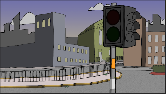
I am rather pleased with my backgrounds in the sense that they draw the eye to the right place on screen (I used some sneaky rule of thirds for help with that). They also have a good sense of liveliness. I say that meaning that the backgrounds look as if there is more to the scene beyond the realm of the camera lens. I know that sounds pretentious, but I worked rather hard on this scenery, agonising over colour palettes and gradients even though it'll all be pointless when I'm dead and the sun burns out.
At first, I set this at daytime with a big bright blue sky. I was one step away from adding a grinning cartoon sun with big sunglasses to the top corner.
I set it at evening time, however, because A) it means I have fewer people to animate because they don't hang out in the evenings so much, and B) the evening is a more specific time of day. It helps set the mood for when the crossing signal men start passionately dancing.
Also, making it evening time rather than having a generic blue sky helps to add another layer of relatable-ness for the audience WHICH INCREASES IMMERSION I GUESS.
A big problem when I designed these backgrounds was adding details to it. Even now I feel like there is more I could add, such as bumps on the road surface of general wear and tear to the buildings and pavements.
For the shots where the camera zooms in on the crossing signal characters, I added increasing levels of desaturation (or I guess you could say I removed the saturation if we wanted to avoid speaking in double negatives). I did this to put the focus even more on to the crossing signal men and draw the audience into their world. That way, when the camera cuts back to the confused man on the street and the colours return to being brighter, it gives that transition more impact.
The above background is my favourite. I like the distinct shading on the buildings and the muted colour scheme that doesn't distract. There's a slight amount of detail, but not too much.


No comments:
Post a Comment