Showing posts with label Live Brief. Show all posts
Showing posts with label Live Brief. Show all posts
Sunday, 5 May 2019
Live Brief 4 - Video Mapping in Lille
I had a mad time in Lille on my second excursion out there. I really enjoy it because it's a chance to do something different with animation, it looks diverse on my reel and I work with people I don't ordinarily work with. I'm pleased with the end result but next year I could push it further in terms of spectacle and originality. Looking back, some elements of my animation this year were resemblant of last year's, such as the music I chose and how I used parts of the opera house to project onto. I'd love to go back next year, register as a PROFESH and be BOLDER in my ideas. I worry that I may fail to be as adaptable as certain other animators.
Tuesday, 19 March 2019
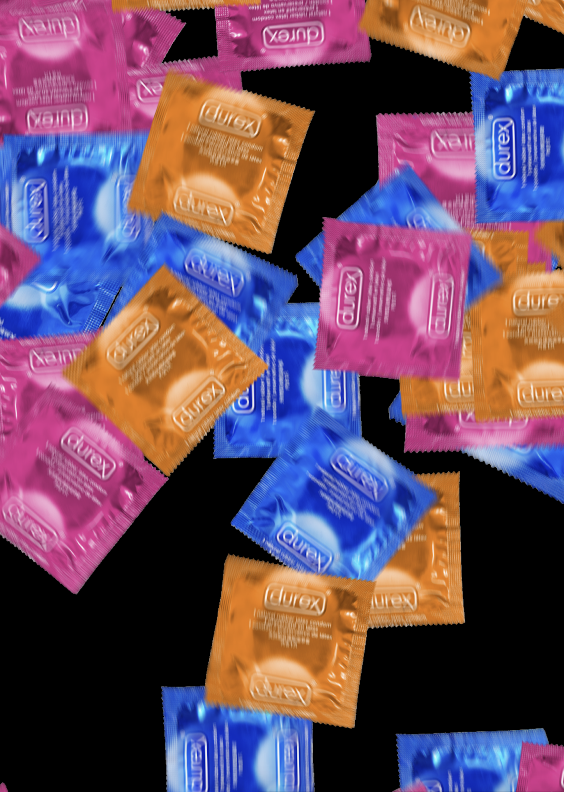
Durex is DONE! Reflection
I am happy with this project. At the last minute I opted not to submit three posters for the sake of it, but instead just two good ones at the recommendation of my tutor. I'm glad I did this as I am now proud to show the whole submission and don't have to justify the poorer quality of the third. Sorry, Jenny Dosh or whatever your name was.


She DEAD
What I learned:
- Again, quality always beats quantity
- I should have done this faster
- Composite more organised-ly you fool
- Artivive is a great tool
- When I push my boundaries and try new stuff, I have fun and add diversity to my reeeel.
- Collabbin with Illustration students offers new perspective.
The last one is especially true. I've done two collabs with Illustration this year and they've both taken me down unusual avenues with look, media and tone. I'd gladly do more of it.
Artivive is rad and I'd certainly try it again. The 3D space is incredibly intuitive. Next time I'd like to use more 3D, though.

Durex is done! Compositing
The last two days have been a nightmare of compositing, as I fell into that old trap of having to name my files 'final', 'final final' and so on and so forth. It left my desktop looking like the aftermath of some horrific battle, with half formed .mp4s and .psds littered randomly and chaotically across my screen. Were I to open one of the Premiere projects now, I would be greeted with a sea of RED indicating that my files are all missing presumed dead, and I would probably never be able to recover them.
I prayed that there wouldn't be a blackout or a crash. As the work becomes more intense, my faith in technology wanes. I've already written off one memory stick this year due to breakage, and Google Drive went down about a week ago. How will I preserve my digital files when technology inevitably fails altogether? And what will my time and work have meant? I suppose the only option is to hope someone appreciates my films in the moment.
It made me think of my final film, and how much MORE prepared I will have to be for it. I have a 50 gig hard drive in my side table at home. I think I will clear it, organise it and rely on it, as Gloop Cafe will be a hefty comp job.
I should be more prepared.
Thursday, 7 March 2019
Live Brief 3 - DUREX. Carrying on
I've been continuing to animate Durex the last couple of days. Yesterday I made a flurry of condoms in After Effects to act as a transition between the scene and the logo. I've made two, one of which will pop out of the poster as a 3d layer.

I've also hastily animated the third poster with a character named Jenny Dosh. It fits with the style, although it isn't my finest animation. An ad campaign with three posters is far better than one with two. Great things are in threes.
 In retrospect, more pre-production would've been useful here. Establishing the characters further and testing more ideas beyond just our initial concept. I pitched a couple of things but we chose the first one. I should have drawn more in depth character designs and focussed more extensively on world building to keep it consistent. I think that the concept and energy of the animation are appealing enough to make audiences overlook those inconsistencies, but as always there's room to improve.
On Friday, we colour

On Friday, we colour
Monday, 4 March 2019
Live Brief 3 - Durex - Animating
Following a recommendation from my tutor, I watched the opening credits of "THE FORBIDDEN KINGDOM for inspiration. It had a dynamic, 3D style which would look sick when applied to the mind-bending forces of AUGMENTED REALITY.

Look at that DEPTH OF field! Imagine that dynamism applied to a picture of somebody offering you a condom.
 LIKE this

I've also been COLOURIN hard. I'm happy with how it looks. Otherwise, the project isn't as organised as it possibly could be. We don't have a gantt chart or anything but we just work on it knowing that it will be done when it's done.
There will be 3 interactive posters. Adrian Frisbee's morning routine, Wonky Nigel's routine and a third one. Still need to think of the third one


Look at that DEPTH OF field! Imagine that dynamism applied to a picture of somebody offering you a condom.


I've also been COLOURIN hard. I'm happy with how it looks. Otherwise, the project isn't as organised as it possibly could be. We don't have a gantt chart or anything but we just work on it knowing that it will be done when it's done.
There will be 3 interactive posters. Adrian Frisbee's morning routine, Wonky Nigel's routine and a third one. Still need to think of the third one

Thursday, 14 February 2019
Live Brief 3 - Durex - Characters and Rough Storyboard
Designed some more refined characters. These people will be hellbent on obtaining a condom in the morning. It's their favourite thing to do.
Here I wanted to return a little to my classical style and incorporate my usual energetic animation. My worry with the characters is that I want to keep them playful and colourful without it seeming patronising and childish to 18-24 yr olds.


Dave Frisbee changed his name to Adrian Frisbee, to sound less like a middle aged Yorkshireman and more like someone the YOOF can relate to.


Shmick Spence needs the most work. I'm not really sure what to do with her so might redesign her a little. In a weekly crit, the rest of the class thought her name made no sense.
To me it makes perfect sense. Her name is Spence and she's pretty shmick.

A brilliantly composited styleframe demonstrating how the AUGMENTED REALITY will look.


The ORIGINAL Dave Frisbee rough storyboard


The ORIGINAL Wonky Nigel Rough Storyboard
Here I wanted to return a little to my classical style and incorporate my usual energetic animation. My worry with the characters is that I want to keep them playful and colourful without it seeming patronising and childish to 18-24 yr olds.


Wonky Nigel's style has been updated since I drew this, so he looks like he could inhabit the same universe as Adrian Frisbee. He still has the flower on his head, though. Someone suggested I change his name to 'Flower Head Jim' but this suggestion was met largely with vitriol and hatred from my coursemates.


To me it makes perfect sense. Her name is Spence and she's pretty shmick.

A brilliantly composited styleframe demonstrating how the AUGMENTED REALITY will look.


The ORIGINAL Dave Frisbee rough storyboard


The ORIGINAL Wonky Nigel Rough Storyboard
Wednesday, 13 February 2019
Live Brief 2 - Hostelworld Comp and FINITO
I have finished Hostelworld!
We got 3 gifs and a final tv spot which has been really well received so far.


Coloured in tvpaint.
 I'm incredibly pleased with how this turned out. It was nice to work on something a little different.
 Were I to repeat the task, I'd emphasise the depressingness of the man's life at the start of the commercial. Luckily, I think sound goes a long way towards building a good atmos. It was our course leader's recommendation that we make a lot of the sounds with our mouths, and I think it gels well with the look.
We got 3 gifs and a final tv spot which has been really well received so far.


Coloured in tvpaint.


Sunday, 10 February 2019
Live Brief 5 - Wetherspoons

I thought it would be cool to be featured in the Wetherspoons gallery so I entered. The conditions of the contest specified that I could only enter my work after having a few pints, and that I was only to create the work using Wetherspoons branded crayons that are handed out for free with the children's menus.

This is me working on the design

And this was the final design which I submitted. In future I must be more experimental with my character design. This brief opened my eyes to the potential of cheap crayons as a creative tool. The medium is the message, after all.
Thursday, 7 February 2019
Live Brief 3 - Durex
I'm collaborating with another illustration student on a Durex ad campaign in AUGMENTED REALITY.
We're going to use ARTIVIVE, an intuitive app that means even luddites like me can produce mind-bending AUGMENTED REALITY

We threw a few ideas around. A video game where you played a condom, flicking STDS away from a helpless person.
We considered animating a horde of cartoon diseases, but since the campaign is aimed towards 18 to 24 year olds and is meant to promote carrying a condom out of habit, as one would brush their teeth, we thought it best to illustrate that point with three case studies. People who always carry a condom.

INSERT FIRST DRAFTS
Thursday, 17 January 2019
Live Brief 1, Loop De Loop
I submitted my Loop De Loop, themed around WINDOWS. I'm very pleased with the storytelling and it was very freeing to work on something wacky, without much of a deeper narrative.
I also strayed a little beyond my regular art style. My line work is terrible, though. I really need to improve that. I was going for a simple, wacky look for the backgrounds but they look like they were drawn with a mouse on Microsoft Paint fifteen years ago.

TV Paint is incredible. It's so handy and helped me complete this so fast.


Wednesday, 21 November 2018
Live Brief 2 - Hostelworld ANIMATIC
We've consolidated our story for Hostelworld. It's about a man who has a dull routine, until he is catapulted into the exciting and diverse world of hostels.
The tricky part is cramming it all into 30 seconds, allowing ample time to show the Hostelworld logo. Also, as they're looking for a campaign, we'll produce one thirty second spot suitable for YouTube and television advertising, and three square gifs for online distribution.
Simon's art style is resonant with people my age and funny.


Simon's art - @sim0gram


These adverts carry a lot of appeal and seem to hold up in a market dominated by very snappy, weird, short form media. The low production value makes these practically meme-able, which is part of their success I imagine. We want to convey a similar tone.
The tricky part is cramming it all into 30 seconds, allowing ample time to show the Hostelworld logo. Also, as they're looking for a campaign, we'll produce one thirty second spot suitable for YouTube and television advertising, and three square gifs for online distribution.
Simon's art style is resonant with people my age and funny.


Simon's art - @sim0gram
I feel like there's a trend of such wonky animation that's gained popularity. It's in the voxi adverts and pretty much every adult swim cartoon.


These adverts carry a lot of appeal and seem to hold up in a market dominated by very snappy, weird, short form media. The low production value makes these practically meme-able, which is part of their success I imagine. We want to convey a similar tone.
Monday, 12 November 2018
Live Brief 2 - Hostelworld
I'll produce a Hostelworld ad campaign for this year's YCN brief. I'm working alongside an illustration student who'll provide the style and a lot of the art, and I'll animate and composite.


The ad campaign must be targeted at students. We're going to tap into their progressive mindset, teaching them that by sharing stories from all over the world, you become wiser and our collective outlook becomes more colourful.
We looked at a few of the current hostelworld adverts featuring gorgeous naked arses and jumping into the sun.


These ads sell freedom and the beauty of the planet (not to mention all those hot arses) but such ads are generic. promoting unrealistic beautiful people. These ads are everywhere, with cars and phones selling sexy dreamy freedom. Its the stuff of parody, and people switch off.


We want to sell the ethos of a hostel. Crazy stories, diversity and world changing ideas debated between virtual strangers, while keeping with Hostelworld's brand of limitless potential and exploration.
Our base idea is to show different hostel dorms from a backpacker's perspective, populated by an assortment of strange people. This could include a 300 year old man, a tiger, a roman legionnaire, etc. The art will be tongue in cheek but the message will be one of shared stories.
Simon works in cutout and weird ink pens, which'll encourage us to be inventive with how we animate.


Some Simon Turner Illustrations @sim0gram
Subscribe to:
Posts (Atom)