Monday 27 March 2017

New Group Project (OUAN406)

We're representing the culture of street art in our kinetic typography project, and want to convey the message of unity amongst the REGULAR JOES of the world. No matter what country we're from, the language of great street art is universal because it represents a raw expression of the human condition that anybody can create.

An important question to ask is "what is the difference between graffiti and street art?' Graffiti is destructive, street art is constructive. That's the positive message we want to convey.

We'll do this with frenetic, fast paced and joyous animation that cuts between various worldwide locations to show the unity that comes from street art. The art and text will dance across the buildings to a thumping, primal drum beat.

I've been thinking about interesting camerawork and scene transitions and backgrounds that we can animate onto. I checked out some famous mural locations in Denmark and Japan.


Sakuragicho Station, Japan. I think one could have a lot of fun animating street art interacting with these pillars

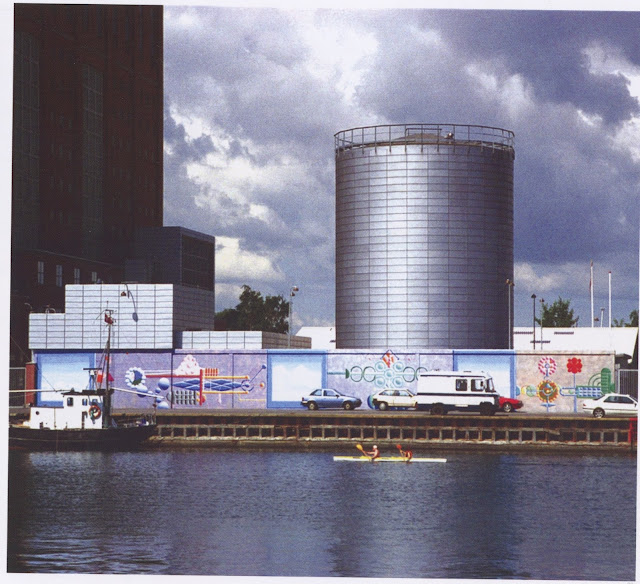
The Svanemølle Power Station, Denmark
The background I drew. I'd like to animate street art onto the silver tower and along the wall.
The only tiff I've encountered with my group so far was over what street art we should animate. We had a big argument over cultural appropriation, with me saying that it's fine for us to take the message and art style of revolutionary murals and do something new with them and my teammate saying that the only true way to pay homage to the street art culture was to copy the murals outright and not amend them at all. APPARENTLY, since Im not from a STREET ART COMMUNITY it would be wrong of me to design new street art, even though the whole point of street art is that ANYONE can do it. But APPARENTLY I'm WRONG.

Anyway, because I am a zen monk, I moved on and let go. That is the the nature of doing stuff collaboratively I guess.

Monday 13 March 2017

25 Second Animation - Finishing it (OUAN405)

Woo I finished my animation. Only now I've watched it a million times over I hate it and I hate the colour scheme and I hate the animation and I hate the sound mixing. But I SUPPOSE that is the way of animation. The moment you finish something and watch it a billion times you think it SUCKS.

I was delayed in the finishing of the animation because I had all the clips lined up in a line and it looked well good, and then my tutor said "it would be funnier if there was more blood" so I was like "UUUUURGH" and then I went back over some of the clips to add more blood. I'm glad I did because I really like the effect, but I think some parts look a little slap-dash.


The blood pools underneath every footstep
I'm pleased with the sound mixing in general. The most important part for me was making sure that the car crash sound was really exaggerated and cathartic, because without it the contact looks a tad lacklustre.

I was quite pleased with the soundscape from my animatic, so I reused quite a bit of it. I added some smooooooth jazz drums to the opening shot, which I think quickens the pace and adds more character.

I'm most pleased with the character animation, especially certain parts of the crossing signal dancing. The backgrounds are certainly a step up from my previous projects in terms of their complexity, but in future I'm very keen to try some more textures and fine details to make the world more real-feeling. At one point I considered animating some background characters. I now regret not doing that because it wouldn't have taken too long and it would've looked nice, but honestly I sort of forgot to.

The opening shot is nice, but the frame rate really vexes me because the camera pan looks a little jolty and I am not sure why.

Finally, I feel like certain parts of the sound scape play a little too quietly in conjunction with other parts of the animation. For instance, I may go back and edit it so that the background traffic noise is a little louder and the jazz music is a little quieter, but it is not a huge issue. Besides, the loud and quiet contrast adds to the effect of switching abruptly between the worlds of the humans and the crossing signal men.

Sunday 12 March 2017

25 Second Animation - Animating From Reference and Animating Some More Shots (OUAN405)

Normally, walk cycles are rather easy. A drunk, blind chimp could animate one.

At least, it's easy to draw a walk cycle along a two dimensional plain. Sometimes I just wish I lived in the world of 1960s Scooby Doo because everything exists on a 2D plain and life is simpler


I also want to live in the world of Scooby Doo so I could commit hilarious crimes.

Literally me af
But SOMETIMES I have to draw a walk cycle from a weird angle or something. And for those drawings I have learned to use REFERENCE for the first time.


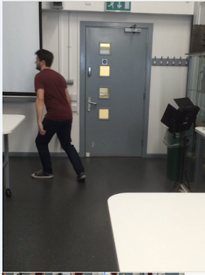
For the shot where the man walks across the road, I filmed my coursemate AND REGULAR MATE (I hope) Alex, walking. I didn't rotoscope it but the footage was really handy for reference.


Later on, when I needed a shot of the same character hobbling across a street, I waited for Alex to come into the studio before hobbling him with a crowbar for a look of autheticity. Then I filmed him limping.


In the same week, I animated my final shot which was one of the most time consuming. I decided to animate every element of the character individually as it gave me more control. Also, since the limping from a distance was hard to animate, breaking it up into portions made it less daunting.

The downside was that I could not merge all the elements of the character into a single video layer because it made Photoshop call me a dumb idiot and spit acid in my eyes and I had to "ctrl+z" it a few times, so it was very irritating having to juggle all the layers of the character.

All these layers are for this one annoying character.
I'm pleased with the shot, though. I imported way too many layers into After Effects, though, which made it crash which was annoying.

25 Second Animation - Final Crit (OUAN405)

I was really happy with the final crit. I got some helpful feedback, all of which I decided to apply to my animation.

The character animation got good reception as it has a good sense of weight and momentum and it's well timed, so I'm well pleased that I don't have to redo any of that. The fact that the guy gets hit by a t-model ford was brought up, and I explained that it was FUNNY because t-model Fords tend to be driven by wealthy old people, and it's funnier when rich old people commit crimes. When a young man commits vehicular manslaughter, it's sad because he has his whole life ahead of him now ruined. This isn't the case for a rich old person.


I was advised to change my opening shots. The second one, I found, looked quite ugly and the fact that it was a still image (since I removed the zoom), made it a dead spot in the animation. I made the background a little more interesting and extended the size of the canvas to give me more space to play with the zoom and 3D layers.

Version one
Better version
I made the buildings more detailed to match the aesthetic of the rest of the animation. Also I added a slight gradient to the buildings in the background.

Finally, I added a shoe to my final shot.

There it is

Monday 6 March 2017

My Pixilation Thing (OUAN405)

I'm pleased with how my pixilation turned out, especially since this was my first time working in this medium. I want to learn to direct. Since I plan to kill Brad Bird at some point and take his place as the new Brad Bird, it was really useful to work in a directing environment outside being hunched in a dark room, staring at a computer screen as the rickets sets in. This time I was working with a real person, so I felt like a proper director! It's good for me to start to learn to flex my directing muscles, as my inability to criticise the work of people who I'm on a team with has plagued me in the past and I want to get past that.

CAMERA-ING:

I worked with a tool called a cam-e-ruh, which apparently is important for films. It was good to boost my confidence with using them. I really really enjoyed solving problems such as lighting, shot framing and working in a really small space and I like to think that I conveyed a good sense of where everything was. Were I to repeat this, I would've put more consideration into my set and what it tells the audience about the character. The set works quite well as it is, as student accommodation has a life of it's own because it's CRAWLING WITH FILTH.

I really like these shots

ANIMATING:

I am pleased with my use of EASE IN AND EASE OUT with things like arm movements. These two principles of animation are definitely in my top fifty principles of animation. Also, I really really like the skid.


I'm not pleased with the transition between the eggs being uncooked and then being cooked because the camera jumps a little. This is because my dumb idiot flatmate blundered into the kitchen and then tripped over my camera stand and moved it and then DIDN'T apologise, but I ate half her food because I couldn't be arsed to cook my own thing so that's okay. Also, my leading man had to take a break halfway through filming to smoke his massive bong or something, so I wasn't working with the ideal team.


There's a clear distinction in the framing between these two shots, which is vexing
Some frames were too fast and others were too slow. I would've loved to add an extra couple of frames to my actor moving down the corridor, and though, for the sake of speed, I took out a couple of frames from the shots where he pours the oil and salt into his pan, maybe I could have stood to take out more.

I cut my actor out of the previous frame and pasted his body into the next frame to make his movement slow down


My ARTISTIC STYLE is better than Wes Anderson's


EDITING:

I am pleased with my sound effects. The African drums add a good pace to the scene, and I tried to add joy and energy with creative sound effects, like using a maraca for the salt shaker and the sound of chickens for the eggs.