Other photoshop things I learnt to make my colouring better:
I am now able to make lines thicker using the "filter" tool, which keeps everything nice and boldly defined and helps to establish depth, a problem which was brought up during the group crit. I also learned that I can improve the quality of LITERALLY any image really simply by just increasing the contrast.
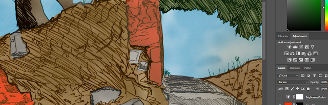 |
| Terrible terrible ordinary contrast |
 |
| Donate to me on kickstarter today to see all my pictures in exclusive good contrast |
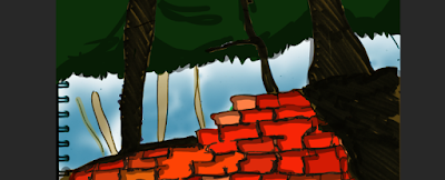
I preferred doing the indoor drawings. It was much easier to choose a palette of three or four colours and the fact that every line was clearly defined made shading and depth much easier. Outdoors, though, I don't think I conveyed depth and perspective so well since the shading was more fluid.
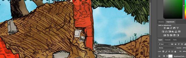
 |
| I am rather pleased with this effect here, where the sky gets lighter as it meets the tree. It's how the eye works in real life and I want to apply this kind of thing to more drawings. |
I definitely still have a billion things to learn. I had trouble keeping track of what layer does what and I know that I can do this kind of thing much faster if I just sharpened up my technical knowledge. I'm quite pleased with how a lot of these drawings turned out, especially the indoor ones, but I recognise the glaring flaws in a lot of them.


No comments:
Post a Comment