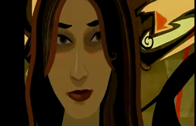
I'm paying attention to the backgrounds specifically. Some look hand-painted, some look rotoscoped, some (like the one above) have a kind of "taking off your 3-D glasses while watching a 3-D film" effect, and some are rather minimalist.
In the film, the inconsistent art style is justified by the movie being about the dreams of one man and his attempt to find and discern the absolute difference between waking life and the dream world. Changing the art style is a good way to embody the uncanny and distorted feeling of dreams.
We want to use a lot of different art styles in our animation. Firstly because neither of the three of us has been allocated the role of "backgrounds guy", so there's no consistent art style to the backgrounds, and also because we are showing off a dozen or so locations around the world and thought it would be cool if every single scene had a different aesthetic. This highlights the cultural differences between countries but how we are all united as one through STREET ART.
We decided to give every single shot a differently styled background because that way, each of our 20 second segments will blend more seamlessly into each other. This was instead of just using our house styles for our segments, which would've been obviously looked like the work of three distinctly different people and that's NOT THE SPIRIT OF COLLABORATION.
We will have the segments joined together with smooth transitions into each other to give the effect of one flowing animation. Also, the entire video will be set to a primal, frenetic drumbeat which will link our individual segments together.


No comments:
Post a Comment