Wednesday 17 May 2017

Compiling our Stuff Together (OUAN406)

This week we all finished our animations and compiled them together into one thing. My earlier concerns that our three separate pieces wouldn't combine well into a single animation and would seem disjointed from one another have kind of been put to rest. What's important is that we stuck to our guidelines.

Each of our segments incorporate a diverse range of styles and fonts to convey the mixed and universal nature of street art.
Each segment is fast paced and energetic.
In every segment, the text moves from left to right. It invokes a sense of progression and certainty. Street art is a powerful, progressive movement.
Each of us used narration

Also, the transitions between each segment are seamless.

I convinced my group that we should all add sound effects to our segments to keep it seeming like one piece. I'm pleased with the way I've used sound. A car screech for this shot


and a clashing cymbal to symbolise the "NEW WORLD ORDER"


Are FUN and PLAYFUL.

My biggest flaw on this project was organisation. Why did I start designing detailed backgrounds before doing a storyboard or animatic? Who knows. Maybe I'm an IDIOT. It explains the delay in my progress and why I felt directionless at the start of the project. Also, my FOLDERS. My FOLDERS are so HORRIBLY disorganised.


So, I have my Animatic on the bottom and my PROPER animatic on the top right. Which is the REAL animatic?

Or is THIS thing the proper animatic? And what the hell is "poper"? I have no clue. I can't remember.

More things that I can't remember what they are.


I don't know what any of these are

I have a crippling fear of throwing anything away in case I desperately need it later, so I keep everything. I can't wait to ditch everything after I hand this project in.

Finishing - Putting it Together (OUAN406)

I stitched together my segment this week and made a few edits. I'm pleased with how this turned out. I think that it packs a lot of energy and catharsis which was always my goal. I'm pleased with how the shots blend together and keep a brisk pace.

I need to work on my background and set design. While I tried my hardest to diversify the background styles to make the aesthetic eclectic, I really want to practice making more subtle marks that imply more nuanced shading and texture. Right now, I use exclusively big block colours to colour and shade with. While that's good for a certain style, it isn't very versatile.

My tutor suggested that I edit my opening shot. The train approaches from a distance and then camera moves to show the train whizzing past from a side on view. I was told that this looked too slow and didn't convey the POWER and speed of the train, and that I should add a blur to the camera movement.


So I DID. And it looks way better now. Much schmicker.


I showed my segment to my teammates and they said that they liked it, except that the camera had a tendency to move too quickly over some of the key words and they were illegible. I took the scene back into After Effects and zoomed the camera out a little which FIXED my problem.

Recording narration:

One of my teammates used the voice of his uncle, who's an actual street artist, for the narration. His uncle is Portuguese or something so his accent had a great continental flair. I really like the idea of a broad range of accents spread throughout our video, so I split my narration into two bits. For the first part, I recorded my own posh-arse voice and for the second part I grabbed Bach, who has a rich Vietnamese accent because he is from Vietnam, to narrate. Give it a bit of DIVERSITY MATE. Because after all, street art is a universal language.

I also recorded one of my classmates, a Leeds native who had a thick Northern accent, but never ended up using it because I ran out of time to include a fourth shot. I should've timed my animatic better. My other teammate recorded in her American accent, so the diversity helps bring the animation together.

Sunday 14 May 2017

My Opening Shots (OUAN406)

This week's final crit was really useful. I had a lot to show and got useful feedback. I'm pleased with my first two shots and think that they convey exactly the energy and catharsis I was hoping for.


The movement of the train took some time to get right. I had to play around with the keyframes a lot to give the effect that the train was getting closer, giving it the illusion of speeding up as it approached the camera. I think it looks a little too smooth. It doesn't rattle around like an old freight train should but otherwise the movement is consistent and it certainly looks 3D, which I'm pleased with.

I wanted the train carriages to act like individual frames of an animation, with the words animated onto the side. I played with this effect for a while before deciding to copy the words, move the copy to one side, reduce the opacity of the copy and flicker between the original words and the copy.

I like how it looks.


A large problem I faced was timing, and this was an issue brought to light in our final critique session. Obviously, the focus of the animation should be the words, yet the camera would move so quickly through a scene that the words became a little incomprehensible. This will be partially fixed when I add the narration over the top to match the words. I don't want to make the words themselves too animated. Graffiti fonts are pretty illegible anyway.

It's hard to find a balance between giving the shot energy and making it so fast that it doesn't make sense. Zooming the camera out a little bit would be really useful for making the scene legible.

I'm pleased with the way that the words bulge and interact with the environment in this shot.


Animating with Maya (OUAN406)

This was far more difficult than the modelling thing. I'm generally pleased with the end results of my three animations although they certainly need tweaking. The timing, for instance, is a little off with the pendulum swing. It swings faster in one direction than in the other direction. I'd like to spend more time familiarising myself the the animation graph editor. At this stage I have trouble comprehending how the movement of the object translates into a line graph, but once I spend more time with it I'll be able to visualise it better.

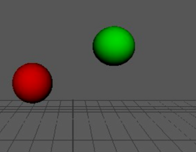
I like the bouncy balls although I could've slowed the whole sequence down to allow myself more time to play with squashing and stretching. I added subtle movements like a slight squash at the top of the bounce as the ball reaches it's highest point.


Once I got the hang of it, the software wasn't too nightmarish. I reminded myself that this is exactly the stuff we did at the very start of the year, only schmicker and slicker, and I got the hang of the other stuff.


The segmented pendulum was the hardest thing to animate. At first I tried animating every segment individually but that was really hard because I would've had to time everything up perfectly. I got taught about how to animate and slightly offset each segment in the graph editor and that was really helpful. Again, I'm looking forward to getting some more in depth tutorials next year. I think it would be really cool to incorporate elements of 3D modelling into my 2D work to make it look CRISPER. Crisp, crisp like a crisply ironed shirt. Just like what BRAD BIRD did with the Iron Giant.


Learning about Maya (OUAN406)

I put this task off for as long as I could because I found it very daunting. Once I got started and knew the basic tools, though, it became rather therapeutic and I actually enjoyed playing with fun shapes. I imagine that they tried to make the software as intuitive as possible, but even some of the simple stuff works about as intuitively as a large hadron collider designed by M.C. Escher.

I mean, to snap one shape so it attaches to another shape I have to Hold G and V while also holding down the middle mouse button and gently wiggling it. These are commands designed by a LUNATIC.

That aside, though, I'm pleased with how my first attempts turned out and I think I learned the basics relatively quickly. I could've stood to slightly bevel the edges of the toy truck, because no actual toy is that pointy. That truck is taking a kid's eye out on the playground for sure.


As for the jam jar with lid I modelled, I like how it looks! I used a couple of video tutorials to work out all kinds of things like smoothing, making new polygon shapes, making sticky out bits and stuff like that. Also, I wish I knew how to make glass textures.


I'm keen to keep modelling in Maya and look forward to learning it more in depth. It is the wave of the future after all or something. My biggest worry now is that I'll go away for Summer, spend three months doing NOTHING and return having forgotten everything. Either that or all the technology will be obsolete and I'll have been replaced by some hip young thing.

I returned to the Jam Jar later to try and make it become glass. I learned a little about how to use refraction and opacity and things, but I'm far from perfecting it.


Monday 1 May 2017

My Storyboard and Script (OUAN406)

This week I finished my storyboard and script, so now I know how I'm going to stick all my backgrounds together and what my transitions will look like, as well as know the actual WORDS I'm going to animate onto the backgrounds.


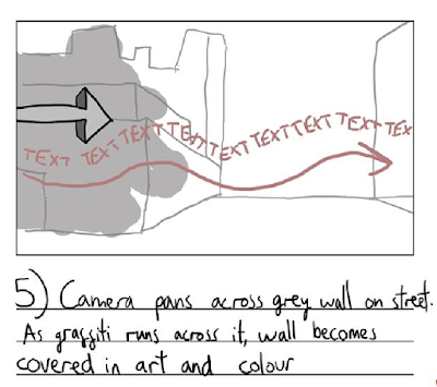
Soz for the grim photo quality. Anyway, I ran my storyboard past my group and got their approval. They mentioned that what they liked particularly were the creative transitions from one shot to another. We want to use minimal cuts in this video.


Whoops, that's meant to be a "7", not a "6"
I'm quite pleased with this storyboard and think it conveys well the rhythm of the animation.

The entire script is comprised of snippets of interviews with street artists I found in college books.

Here's the whole thing:

KNOWLEDGE IS POWER
LIFE IS NOT FOR DEMOTIVATION. IT IS FOR ACTIONS, ACHIEVEMENTS, SATISFACTION.

THE NEW WORLD ORDER WANTS YOU TO GOT TO WORK, STARE AT THE COMPUTER SCREEN, GO HOME VIA THE SHOPS

YOU SHOULD TAKE PART IN YOUR CITY

IT IS SELF ASSERTION, NOISE. ONLY A FEW PEOPLE THINK ABOUT IT BY LOOKING AT GRAFFITI.

WHAT IS THIS?

I thought it important to use words from actual street artists, firstly because the rest of my group is doing that and it would seem out of place in the finished script if I didn't follow suit. Also, not being a filthy street degenerate, I don't know anything about street art. Since we're supposed to be representing the culture, it wouldn't be accurate of me to put my own slant on it. (only joking about that street degenerate comment by the way)

I used interviews with the following artists:

- SKLAWL
- SHIZENTOMOTEL
- SOLO-1

Looking at "Waking Life" (OUAN406)

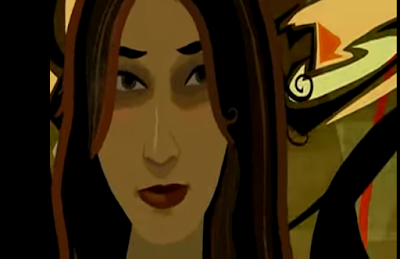
What's cool about "Waking Life" is that it meshes a whole bunch of different art styles together yet remains one cohesive piece of film with a distinct trippy, off the wall identity.


I'm paying attention to the backgrounds specifically. Some look hand-painted, some look rotoscoped, some (like the one above) have a kind of "taking off your 3-D glasses while watching a 3-D film" effect, and some are rather minimalist.

In the film, the inconsistent art style is justified by the movie being about the dreams of one man and his attempt to find and discern the absolute difference between waking life and the dream world. Changing the art style is a good way to embody the uncanny and distorted feeling of dreams.

We want to use a lot of different art styles in our animation. Firstly because neither of the three of us has been allocated the role of "backgrounds guy", so there's no consistent art style to the backgrounds, and also because we are showing off a dozen or so locations around the world and thought it would be cool if every single scene had a different aesthetic. This highlights the cultural differences between countries but how we are all united as one through STREET ART.


We decided to give every single shot a differently styled background because that way, each of our 20 second segments will blend more seamlessly into each other. This was instead of just using our house styles for our segments, which would've been obviously looked like the work of three distinctly different people and that's NOT THE SPIRIT OF COLLABORATION.

We will have the segments joined together with smooth transitions into each other to give the effect of one flowing animation. Also, the entire video will be set to a primal, frenetic drumbeat which will link our individual segments together.

My Post Easter Break Mindset + Progress (OUAN406)


I wasn't feeling terribly optimistic after the easter break. So far we seemed to have been communicating poorly in the sense that we didn't have a storyboard or animatic for the entire animation. What we know so far is that we want to animate street art interacting with various environments around the world, so it's good to have that overarching theme. I'm not too sure what stage the rest of my group are at or what stage we're MEANT to be at.

In the end, rather than assigning roles like "background artist" and "After Effects guy" we thought it best for each of us to animate our own twenty second long segments in their entirety and then stitch them together, which filled me with much more confidence as I have more control over the part I'm going to be making, rather than drifting aimlessly with no purpose as I felt I was at the start of the project. It's a nice idea. In future projects I'd like to go down the route of having assigned roles as it is more professional. It's how studios work, with everyone making something greater than the sum of it's parts. This arrangement feels more like we are just making our own animations, which isn't ideal.

We are collaborating in the sense that we are running our scripts and our scenes past each other for the approval of the rest of the group. This also helps us keep our animations in the same sort of style. So far we've come to group conclusions about our soundtrack, the way we want to use narration and the eclectic, frenetic art style. In that sense, the animation is definitely a team effort which I like.


I have three backgrounds so far, two completed and one in development and will draw a fourth. Once these backgrounds are all finished I can animate the text onto them with Adobe After Effects.


I shouldn't have drawn my assets before drawing my storyboard


I had to make a couple of changes to some of my backgrounds to give them distinctly separate art styles so they're eclectic. I made the train tracks look more realistic and the power station tower in Denmark look more weird and slightly cartoony by changing the colour of the sky.


By the end of this week, I VOW that I will have finished my script and storyboard and worked out the timing to extent. It's good to get all of this cemented in my head. It was incredibly stressful feeling so directionless over the past couple of weeks.