Sunday, 18 December 2016

Environmental Storytelling Feedback Session (OUAN404)

This was a very valuable session in some ways, but less valuable in other ways. It was good to have the drawings I'd done so far formally commented on so I knew if I was veering off the straight and narrow or not. I'd rather have had the entire class split into two so one set of presentations could've taken place in the morning and the other in the afternoon. By the end of the six hour day, it wouldn't have mattered if the presentation had been orated by Orson Welles because after watching thirty five other presentations virtually back to back, my mind was elsewhere. I'm a boy who's full of beans, and I became very fidgety.

But that's more of a me problem, and unrelated.

Before the presentation, I had been watercolouring a few of my A3 drawings. I also showed off some of the drawings as they appeared in black and white.


The main feedback I received was that my line making in fineliner was good and clearly defined and bold.


Wednesday, 7 December 2016

Captain Character Part Four - Final Design And Stuff (OUAN404)

Here's my final turnaround for MILAN TURNER.


I am pleased with the way that this turned out although I would have liked to make it a little smoother and slower by adding more than twelve frames to the turnaround. My biggest problem here was that I accidentally set the frame rate in Photoshop to thirty a second, which buggered the whole program coz I couldn't change it back properly and it went all disjointed and at different speeds and things. Instead, I imported every frame into Adobe Animate which unfortunately meant having to resize and re-position every drawing, so that's the reason for why it may seem a little askew at times.


 I started off by ascertaining what MILAN TURNER's dimensions were through drawing T-poses.


Then I drew each frame of the turnaround, trying to keep to the guidelines of this magic circle that told me where to put every foot position for every frame. I think that the feet look relatively grounded and make MILAN TURNER look very well balanced. Then I scanned them in and traced over them in Photoshop to get rid of the grubbier details.


Working out the colouring and clothing were a lot of fun. The outfit was partially inspired by this bloke I met in Australia who dressed like a cartoon character in the sense that he never wore anything but a backwards hat and a very baggy sleeveless shirt. He was quite rowdy but with a heart of gold (sort of), a little like MILAN TURNER. I liked the idea of a baggy singlet because it helps to keep the defined shape that makes a character stand out, but also, because the singlet is loose, allows for some really fun animation involving the fabric moving about and some really neat follow-through animation. I also really like the shape of the tracksuit bottoms. The curve is really nice to draw and helps to carve out a more distinctive character silhouette.


I experimented with a few colours at first. The reason why I chose blue and orange in the end is because they're complimentary to each other, being at the opposite ends of the colour wheel.


My final design

Captain Character Part Three - The Face Bit (OUAN404)

I looked at a lot of shapes for the face of MILAN TURNER, including a lot that I would never ordinarily consider when designing characters in the past.


I also experimented with a bunch of noses


I'm not a huge fan of cartoon heads that are just one shape. It's cool to use the shape as a guideline and add things on later, but when somebody's head is just a circle or square, I don't really care for the simplicity. Of course, there are exceptions to this, but overall it can be quite lazy.

Bart Simpson and Cyanide And Happiness are two of the exceptions


Were I to draw one-shape heads, I would feel like there were oodles of interesting chins and forehead designs that I was missing out on by being too simplistic.


Here are some more interesting head shapes I doodled.

I tried to follow the tutor's advice and let the pen roam freely when laying out some basic head shape designs. It helps to give them some interesting variety. Eventually I settled on this, which I designed by first drawing a circle for the top part of the skull and then adding various chins and foreheads to it until I had a design I was pleased with.


A very early, untouched design.
I gave MILAN TURNER big ears, a large round nose and a protruding chin. Then I took the face for a test drive with some wacky expressions.


The mild sneer/ disgust one is my favourite


Doing the facial expressions was my favourite part of this brief. Sometimes I use my own face for reference in my phone reflection. Drawing the faces brought me such inexplicable glee, I think because the expression can be changed dramatically with a really small error, there's a great feeling of accomplishment when I get it just right.


Also, I tried a couple of different eye styles. I liked the eyes in "Ethel And Ernest" which I had recently seen but decided that they were more subdued and charming and didn't have the energy to convey MILAN TURNER's brand of energy drink induced mayhem.


Captain Character Part Two - What They Look Like (OUAN404)

I experimented with a whole load of body shapes for MILAN TURNER. I found it hard at first to push the boat out and come up with some really unconventional shapes. Our tutor told me to let my hand draw in a random direction and play around with the shape I had made, but it was very difficult to break from the style I have become accustomed to over the years.

We were taught that many animated characters are first imagined as just one or two basic shapes, and then elaborated upon. This is what makes them recognisable.


The "Inside Out" characters all originated from super duper simple shapes


I came up with a few decent torso shapes with ellipsis', pears and squares and stuff. In the end, I decided that Milan Turner would look more regular shaped. He isn't super healthy or unhealthy so there is no need to emphasise much weight or muscle. As well as this, I think that had I gone too exaggerated with the torso or stomach, then the character was in danger of slipping into the realm of being too much of a cartoonish stereotype.


I liked this slouched posture with the three circles in the middle.  It has a look of uncouth-ness to it.

Then I elaborated further with the basic body shape I chose of a long oval, drawing small variations on it to see how they affected the character. The dimensions could make him look stocky, densely packed together, lanky or very airy and light. 


MILAN TURNER wears a very long and baggy tank top, so you can't really tell where his torso ends and his legs begin. I wanted his body shape to be lean and not too bulky, to reflect his abundance of spritely youthful energy. He also wasn't allowed to be so tall that he could be incredibly clumsy.


And then I drew a few basic action poses, to get MILAN TURNER's character across. I'm pleased with the sense of vitality and motion in these.

Captain Character Part One - Who They Are (OUAN404)

The hardest part about this character design study task was coming up with an original initial concept. I wanted to stay clear of the conventional character traits and avoid the traditional tropes of antagonist, protagonist, underdog, grizzled misanthrope who really has a heart of gold, zany sidekick and all those other ones. Nothing too played out because in truth, the most forgettable characters are the ones who can be lumped together under a broad banner like "incompetent mob boss" or "hyper-masculine lumberjack" . It's why no one should ever try to design a "funny deadbeat Dad" character ever again, because all the good jokes that can be made have been done by Homer Simpson at least three times over.

Oh, and I didn't want to make a creepy self insert character. Just because I want to see myself written as the main love interest for Judge Dredd doesn't mean that the general viewing public also wants that.

I briefly considered drawing a 20 year old history student named Desmond who, after a drunk mistake resulting in the destuction of city property, gets sentenced to a summer of community service with hardened criminals. I got put off that idea and I can't remember why, but I decided to develop a new character instead called MILAN TURNER.


Milan Turner is fifteen years old. He comes from a middle class family with a very pious Catholic Mother and a loving Father who isn't around much because his work takes him on loads of worldwide business trips. He is a bored teenager in a small English village who doesn't work hard enough at school to have much scope for advancement in the world, despite being afforded every opportunity. He is a bit of a rowdy teen, sporting a tracksuit and a rusty BMX, and who is the ringleader of a small gang of other rowdy teens who spend their evenings loitering around the village, swilling energy drinks and calling each other dickheads and stuff. However, unlike some rowdy teens, Milan Turner uses his powers of youthful energy and a sense of invincibility for good, rather than evil. He and his gang spend the evenings seeking out crimes to solve and criminals to stop using brutal vigilante justice. They are a small group of rowdy and unpolished crime fighters occupying their own world within the village and they live for the thrill of the chase on their rusty BMX bikes. They mostly solve crimes because they have bugger all else to do, though. I mean, they're still rowdy and obnoxious, but not entirely evil. They're giving back to the community in their own way, I guess.

My one regret about choosing this character was that I thought of an awesome character halfway through the project who would've been really fun to make. He's a cult leader who tells his followers to steal zoo animals so that they can recreate the garden of Eden. Shoulda drawn that bloke. Oh well.

Sunday, 4 December 2016

Looking at Karrot Animation Studio (OUAN403)


Taking the advice of my course leader, I went and checked out Karrot animation studios, a London company that's worked on projects like Adventure Time and The Amazing World of Gumball
but who also make short films with a tonne of charm packed into them. They do a load of creative commissioned work as well for a massive range of companies, so it was certainly worth my time to look into them.


They're a great example for me of how one can switch up their art style and still keep their own personal flair in a piece of animation, and this relates to my own animation skills because I want to push my boundaries but am not sure how. I'm too set in a certain cartoon style which isn't always a terrible thing if you're established in the industry like Scott Adams or Hergé, but to do contract work I'll have to be able to turn my hand to a bunch of styles.

All of Karrot's videos have a great sense of energy and timing to them that I want to emulate through my animation, whether it be through collage or pixel art. While I'm not a huge fan of all of their work stylistically (I don't really care for the ostrich one), I admire their broad range.


Unlike Karrot Animation, though, I refuse to EVER do a contract for Amazon or a company like that. I don't care if I'm sleeping in a hollowed out log in a dump because my artistic integrity is not for sale to a company that holds billions of pounds in offshore tax havens.


That is an issue for another day, though.


Thursday, 1 December 2016

"Surprise" Animation Research (OUAN403)

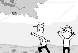
I got inspired by many things for this piece. Primarily, Bird Box Studio's "Sketchy Ice Creams" video, which lent some inspiration to my background and character design.


What I found really funny about this animation, and what I sought to emulate in my own, was the fact that (for me at least) the physical comedy was funnier because the audience is very disconnected from what's happening on screen because there are no emotional facial expressions, no close up shots and no zooms or anything. With some short films, only using one camera angle is unlikely to pay off. I mean, I wasn't emotionally invested in these characters but because there was no emotional intensity to it made their physical humour funnier. I also looked at the sound editing in this animation, which had a really nice balance of relaxing background noise like tweeting birds and foreground noise like park swings and it made me consider the mix of sound I wanted in my animation. I included tweeting birds but decided against the sound of a gentle breeze because I was worried that it would negate the foreground noise. Obviously, this animation influenced me stylistically although I tried to aim for less of the "sketchy" vibe (for instance, the look of the trees in the foreground)

I made the boys' trousers matte black with no indication of which leg was which after being inspired by Bob Godfrey. I was watching some "Roobarb and Custard" and noted that with many of Godfrey's walk and run cycles, he doesn't distinguish between the legs of his characters and there's no depth, which simplifies the walk cycle by fifty percent and means less animation needs to be conceived. I learnt that Bob Godfrey is like the master of walk cycles, and the guy who created the two frame walk cycle. While I didn't want to go as simplistic as that, but I still adopted his principle.


Look at his legs! You can just repeat the same few frames because you don't need to redraw them as front or back legs.

At first I was having trouble with voice recording. I went into the soundproof booth a couple of times because I couldn't really record something that fitted with the video. Firstly because I can't sound like a ten year old boy and also because the dialogue didn't fit with the movements very well. Then I remembered that awesome Manchester Animation Festival short film, "Fishwitch", which had great comedy while the characters only communicated in nothing but garbled nonsense.


So I just recorded some garbled nonsense and I was pleased with the outcome.

Wednesday, 30 November 2016

15 Second Animation Peer feedback sesion (OUAN403)

Our year group, giving feedback (dramatisation)


Today's feedback session on our animations was really successful. It was also really cool to see what everyone else had produced and how diverse everything was. There were really cool art styles and concepts being thrown around that I wouldn't have thought up myself, but I can now take inspiration from (BRAZENLY RIP OFF). Not to toot my own horn, but I was pleased with the reaction that my piece got. I was hoping it would be funny, and it was.

Here are some of the negative comments I recieved:

My sense of gravity could be a little askew, one guy told me. When the boys run up to the tree, the square headed one floated a little too much between strides.


 Also he said that the speed at which the boy's arm throws the rock at the tree isn't fast enough to justify the speed of the flying rock. The arm moved too slowly and the rock moved too quickly.


This guy also gave me no positive feedback. Just negatives as he dropped those two bombshells on me and went to wreak havoc elsewhere on other people's ART. OI MATE, ever heard of a compliment sandwich?

My grandfather used to say to me "never leave the bread out of a compliment sandwich, or you will get figurative mayonnaise on your hands"
 There is validity to his points, though, and I had to redraw both the running sequence and the stone throwing sequence because of pacing issues. The updated ones are definitely better than the original ones and I was very careful with my keyframing, but were I to redo this piece I would change the speed of the boy's arm when he throws the rock.

Another criticism I got was to do with the lack of varying camera angles. I've addressed this in a previous post and I agree that I should've put in a close up shot to show the scheming boys picking up the rock, but time constraints and my lack of imagination meant that I didn't think of it until it was recommended to me very late in the game. I had the opportunity to push the boat out more than usual with this project by adding more variety to my shots, and I didn't take it which I regret.

On the positive side, I was praised for my simple and memorable character design and the way that my background made one classmate feel very "relaxed" and "peaceful". I got a lot of compliments about the background, regarding the simple lines that implied a rolling hillside moving off into the distance and the style of the clouds.

I was also commended on the humour. I'm glad that I deviated from my original concept and went for something more outlandish. People seemed to be impressed by how well timed it was considering the fifteen second long criteria. Also, the voice acting. Now, I don't consider myself to be a great actor.

Oh, wait a second. I DO consider myself to be a great actor. Perhaps the greatest of all actors. And my bear sounds I recorded were oft eulogised by my peers. It gave the animation more of a handmade feel and while I'm all for downloading sound effects (I got a bunch of them myself for this project) I prefer to do the voice acting myself for the uniqueness it gives the animation, as well as the fact that I love the sound of my own voice.

Monday, 28 November 2016

Pendulums (OUAN403)

This is the first bit of line testing that we were taught to do, many weeks ago.


It's fine, I suppose. It doesn't show up very well on the line test because of the light pencil marks, because back in October I was a big wuss who didn't know how how to be BOLD with my pencil marks. Because we had to restrict it to twelve frames, my poor foresight in adding an extra frame at one end of the swing to exaggerate the slow in/out of the pendulum left me bereft of a frame at the other end, so this looks a little wonky.

Saturday, 26 November 2016

Study Task: Environmental Storytelling PART TWO (OUAN404)

For the indoor location I wanted to draw, I wanted somewhere with large open spaces to be diametric to the grim, damp and cramped brick wall and trees from earlier. I went and checked out a large brainwashing facility in the centre of the city oh woops I meant church.

Leeds City Cathedral actually

The biggest problem I had while drawing here was that I kept getting harassed by this old nun. She kept making up all these ridiculous rules that I had to obey if I wanted to draw in the church. First she was like "take your hat off" and I was like "why?" and she was like "because men don't wear hats in the church" and I was like "why?" and she was like "because it is the rule".

I guess that God loves you unconditionally, unless you wear hats in church. Then it's an eternity of suffering for you, mate. And then I couldn't draw in a certain part of the church because it was extra godly there and then I couldn't draw during mass, so I had to do multiple trips to this church.

I really enjoyed drawing here, because there were chairs and also it was a really peaceful environment MOST OF THE TIME. The cathedral felt like it had many many ancient stories within it.


All the tiny details were really fun to draw and, unlike with drawing the autumn leaves, every detail of the architecture of the church fit together. I enjoyed working out the perspective of the grand scale of the arches and how the columns shifted off into the background in a row, wanting to show to tall ceilings and vast interior. That's why I drew looking upwards. A low angle perspective in scenery can infer a sense of strength and power to it. For the most part, the building seemed well lit and airy, but there were dark chambers and corridors running through the arches and next to the pulpit. It's the kind of place that I'd be happy to explore for hours if I had total free reign.  

Hopefully these drawings convey the general cathedral-y atmosphere that was here. It's the kind of atmosphere where one can really feel the sense of unaltered history around them, which I tried to pay homage to by focusing on the details in the stone pillars and altars.


There is also a tonne of great potential for interesting camera angles and dynamic shots, probably moreso that with my first location. All of the pillars and passageways would look good when shot using the rule of thirds. Lots of hiding places make for good suspenseful scenes.


I tried a bit of a different style for this drawing. The windows of the cathedral are very large, but when the light shines through them they can seem very looming.