Wednesday, 30 November 2016

15 Second Animation Peer feedback sesion (OUAN403)

Our year group, giving feedback (dramatisation)


Today's feedback session on our animations was really successful. It was also really cool to see what everyone else had produced and how diverse everything was. There were really cool art styles and concepts being thrown around that I wouldn't have thought up myself, but I can now take inspiration from (BRAZENLY RIP OFF). Not to toot my own horn, but I was pleased with the reaction that my piece got. I was hoping it would be funny, and it was.

Here are some of the negative comments I recieved:

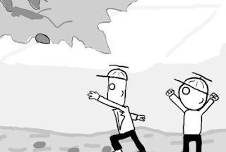
My sense of gravity could be a little askew, one guy told me. When the boys run up to the tree, the square headed one floated a little too much between strides.


 Also he said that the speed at which the boy's arm throws the rock at the tree isn't fast enough to justify the speed of the flying rock. The arm moved too slowly and the rock moved too quickly.


This guy also gave me no positive feedback. Just negatives as he dropped those two bombshells on me and went to wreak havoc elsewhere on other people's ART. OI MATE, ever heard of a compliment sandwich?

My grandfather used to say to me "never leave the bread out of a compliment sandwich, or you will get figurative mayonnaise on your hands"
 There is validity to his points, though, and I had to redraw both the running sequence and the stone throwing sequence because of pacing issues. The updated ones are definitely better than the original ones and I was very careful with my keyframing, but were I to redo this piece I would change the speed of the boy's arm when he throws the rock.

Another criticism I got was to do with the lack of varying camera angles. I've addressed this in a previous post and I agree that I should've put in a close up shot to show the scheming boys picking up the rock, but time constraints and my lack of imagination meant that I didn't think of it until it was recommended to me very late in the game. I had the opportunity to push the boat out more than usual with this project by adding more variety to my shots, and I didn't take it which I regret.

On the positive side, I was praised for my simple and memorable character design and the way that my background made one classmate feel very "relaxed" and "peaceful". I got a lot of compliments about the background, regarding the simple lines that implied a rolling hillside moving off into the distance and the style of the clouds.

I was also commended on the humour. I'm glad that I deviated from my original concept and went for something more outlandish. People seemed to be impressed by how well timed it was considering the fifteen second long criteria. Also, the voice acting. Now, I don't consider myself to be a great actor.

Oh, wait a second. I DO consider myself to be a great actor. Perhaps the greatest of all actors. And my bear sounds I recorded were oft eulogised by my peers. It gave the animation more of a handmade feel and while I'm all for downloading sound effects (I got a bunch of them myself for this project) I prefer to do the voice acting myself for the uniqueness it gives the animation, as well as the fact that I love the sound of my own voice.

Monday, 28 November 2016

Pendulums (OUAN403)

This is the first bit of line testing that we were taught to do, many weeks ago.


It's fine, I suppose. It doesn't show up very well on the line test because of the light pencil marks, because back in October I was a big wuss who didn't know how how to be BOLD with my pencil marks. Because we had to restrict it to twelve frames, my poor foresight in adding an extra frame at one end of the swing to exaggerate the slow in/out of the pendulum left me bereft of a frame at the other end, so this looks a little wonky.

Saturday, 26 November 2016

Study Task: Environmental Storytelling PART TWO (OUAN404)

For the indoor location I wanted to draw, I wanted somewhere with large open spaces to be diametric to the grim, damp and cramped brick wall and trees from earlier. I went and checked out a large brainwashing facility in the centre of the city oh woops I meant church.

Leeds City Cathedral actually

The biggest problem I had while drawing here was that I kept getting harassed by this old nun. She kept making up all these ridiculous rules that I had to obey if I wanted to draw in the church. First she was like "take your hat off" and I was like "why?" and she was like "because men don't wear hats in the church" and I was like "why?" and she was like "because it is the rule".

I guess that God loves you unconditionally, unless you wear hats in church. Then it's an eternity of suffering for you, mate. And then I couldn't draw in a certain part of the church because it was extra godly there and then I couldn't draw during mass, so I had to do multiple trips to this church.

I really enjoyed drawing here, because there were chairs and also it was a really peaceful environment MOST OF THE TIME. The cathedral felt like it had many many ancient stories within it.


All the tiny details were really fun to draw and, unlike with drawing the autumn leaves, every detail of the architecture of the church fit together. I enjoyed working out the perspective of the grand scale of the arches and how the columns shifted off into the background in a row, wanting to show to tall ceilings and vast interior. That's why I drew looking upwards. A low angle perspective in scenery can infer a sense of strength and power to it. For the most part, the building seemed well lit and airy, but there were dark chambers and corridors running through the arches and next to the pulpit. It's the kind of place that I'd be happy to explore for hours if I had total free reign.  

Hopefully these drawings convey the general cathedral-y atmosphere that was here. It's the kind of atmosphere where one can really feel the sense of unaltered history around them, which I tried to pay homage to by focusing on the details in the stone pillars and altars.


There is also a tonne of great potential for interesting camera angles and dynamic shots, probably moreso that with my first location. All of the pillars and passageways would look good when shot using the rule of thirds. Lots of hiding places make for good suspenseful scenes.


I tried a bit of a different style for this drawing. The windows of the cathedral are very large, but when the light shines through them they can seem very looming.


15 second animation PART THREE (OUAN403)

I completely deviated from my animatic. In the beginning, the boys would hit the hive with the rocks, causing the tree to become unbalanced and fall on them. Then I animated up to the bit where the hive landed on the floor and cracked open and a whole universe of possibilities opened itself to me.


In the new version the boys get mauled by a bear
This meant, however, that I had trouble keeping to the fifteen second brief because at the end I had no animatic to work from. The total animation lasts 15.82 seconds in fact. My one regret is that the animation wasn't allowed to be any longer, otherwise I reckon I could have shot the entire mauling scene.

Our course leader gave me two pieces of advice. Firstly, to add more detail to my backgrounds to make the environment more interesting. I wish I had taken some screenshots of the tree and beehive before I altered them because to be fair they did look a bit crap. The tree was just two block colours for the trunk and leaves and the beehive was an ellipsis with a bunch of lines drawn on it. I also added a couple of falling leaves to the background. I'm glad I changed it. It looks nicer.

I was also advised to add another camera angle or two, perhaps a close up to indicate the sneakiness of the little rascals. I had initially planned another shot that would have the boys in the foreground and the tree in the background, about to fall on them, but obviously my plans changed. Having said that, in hindsight there's no reason why I couldn't have done the same shot, but just replaced the tree with the bear emerging from the hive. Oh well. I'll just add that to the "regrets" pile. Also time constraints.

I edited this with PowerDirector13, my software of choice in A-Level. However, next time I promise myself I will use Adobe Premiere. The reason I didn't use it this time was because there were certain tools that I couldn't remember how to use and there was nobody about to help me so I thought I'd just stick with what was familiar. I'm quite pleased with the sound editing in this, although I keep replaying certain tiny details over in my head, like how the square headed boy's dancing and his humming don't match up properly by half a second and now it bugs the hell out of me. Still, having the soundproof booth at my disposal in this instance was a real blessing, I'm hoping to hone my voice acting skills over the course of the next three years.

15 second animation PART TWO (OUAN403)

Ah god I haven't updated this blog in so long. I recently finished the animation. here it is:


Little Rascals from Christopher Hoare on Vimeo.

And there's a lot I've learnt and a lot that I think I can improve. The biggest problem I faced ended up being technical. I often found that sometimes, out of the blue, if I wanted to copy something like a still character and paste it onto the next frame, Photoshop would just place it into an entirely new layer. But then again sometimes it didn't. So I ended up with all these extra layers cluttering up my screen. Towards the end of the project I had about 33 layers in various groups and scattered about and it stressed me out a bit. Otherwise, I enjoyed animating on Photoshop. There weren't that many limitations to it in the end and I got the hang of most of it, although I haven't done anything involving camera panning or zooming in yet, or even adding in more than one variety of shot.

I'm pleased with the actual quality of the animation, though. I'm glad that I started out with very simple looking characters while I focused on building confidence with digital drawing, and I think I'm getting better. I'm also pleased with the way that the bear turned out. Drawing it involved using more complicated measurements and ratios than drawing the two boys. For those characters I just used the basic guideline that their heads were the same height as their torsos. Now I'm keen to move onto something a little more complex. I'm pleased with the way that I applied the twelve principles of animation. The little rascals themselves have good timing to them and move very organically, and I'm getting a little better at predicting how many frames a certain action will require, which allows for more fluid keyframing.


Man, look at the stretch on that rock. And look at his weird disproportionately sized hands.
I animated this entirely with key frames, and the only straight ahead animation I did was for the flying rocks, the beehive and the leaves and the bees and stuff like that. I don't really buy into the argument that straight ahead animation allows the artist more freedom because they don't have guidelines to follow. I think that key frame animation allows just as much freedom. Occasionally I would add a few frames of space in between my keys to free up the opportunity for some extra anticipation or some slow in or slow out.


When I was bored I added leaves in, to create a living world.


Tuesday, 8 November 2016

Week something or other: 15 second animation PART ONE (OUAN403)

We've been tasked to create a ten to fifteen second animation based around one of a selection of words. I chose "surprise", but I think I went about it wrong. Rather than choosing the word and then thinking of an animation that accompanies it, I just thought of something that would be funny to animate and found the word that would best justify it.

I decided to tell a story of two young rascals who throw rocks at a hornets' nest, but in doing so unbalance the tree so it falls over and crushes them. Were I to go back, I probably would've given it more thought as there are so many other possibilities for great concepts based around these words, but oh well. The main thing I'm focussing on is learning how to do basic digital animation with this project, which is a steep learning curve as I have never done it before.

One frame from my storyboard
When I visualised this animation, I was reminded of the kinds of videos made by Bird Box studio, who do simple short films with a really understated art style and great comedy timing, which is similar to what I'm trying to accomplish with this 15 second animation. I took inspiration from their distinctive character design. 

I would like to emulate an aesthetic similar to this for this project. It has charm and personality.
The biggest problems I've faced so far have all been technical, involving stuff like digital painting with the Wacom tablet, which is another reason why I'm keen to start off with an animation like this, which is straightforward with an unchanging camera angle. but I'm really loving using layers on Photoshop to create detailed backgrounds that I never could have made before without having to redraw them on every new frame. The animatic went well, and now all I need to do is animate it!

Study task: Environmental Storytelling PART ONE (OUAN404)

We were told to seek out two spaces, one interior and one exterior, and do some drawings that respond to them in order to learn about how environments can be used effectively in animation to add context to a scene. The environment that a character occupies can dictate their mood, the way they move around and how they interact with things around them, so it is very important to understand it.

I decided not to choose a location to visit beforehand. I figured that many people would draw at similar places around the city which I wanted to avoid doing so I set off in a direction chosen at random to find a good place to draw that was more unconventional.


I didn't want the outdoor location to seem too staged or stereotypically dark and manky. I just wanted it to have an enclosed feel to it. It didn't have to be an exceptionally ugly place because I think that a compelling story can be shot anywhere without having to exaggerate the environment. While the environment is important for the reasons I listed above, a great story is great because of the characters primarily. I wanted the place to look realistic which was another reason why I didn't plan a location beforehand. I didn't want to have any drawings visualised before I set out.

Here's where I went

I stumbled across a section of broken down wall next to a hedge just outside the city, which I thought was a perfect place to document a dark, enclosed area. I liked it because it seems like a good place to shoot something like a grizzly murder. It's not totally secluded, because you can hear the faint sound of cars passing on the road which adds a rough vibe to the location.

I made a few quick thumbnail sketches, but I was more keen to just get on with it.
I tried to sketch this space as being cramped and uncomfortable, which it was. I hope that it comes across in my drawings. I sat on a rotting piece of old rock in the damp moss and my legs turned numb coz the blood was cut off. The trees and bushes restricted a lot of the light. Most importantly, I tried to convey how dilapidated the place looked through rough pen marks. Fineliner seemed like the ideal media to work in for these drawings as they can look very scratchy and unpolished to mirror the grungy vibe that the location gave off. 


Bloody autumn leaves take years to draw. I wish that seasons didn't exist.


Looming trees block out the light
I added a little copic pen for variety.
With the drawing above, I tried to capture the mood of the dark and slimy moss and the decomposing leaves in a close up shot, but I don't think it looks too great because it lasck detail. Tomorrow I'm going to draw an indoor space that is hopefully the exact opposite of the crumbling wall. 

Tuesday, 1 November 2016

Week Five: Set, Series, Sequence PART 2 (OUAN404) Visual Language

This week I developed a short narrative inspired by my previous drawings associated with hammers. The teacher told us to make a twelve frame storyboard, but I made mine sixteen frames. I guess this work ethic will stand me in good stead in the future.

Job interviewer:        "What would you say is your biggest weakness?"

Me:                            "Sometimes I work TOO hard"

Job interviewer:        "Congratulations. We think you'd make an excellent toilet attendant.                                        Welcome aboard"

I have vowed to make my next storyboard digitally because I am utterly inexperienced with digital drawing and want to get my skills up, even if it ends up looking terrible. It would really help me to progress with photoshop, which is currently the most challenging part of the course for me. Also, computers are the way of the future and I don't want to be left behind.

In the meantime, I'm pleased with this storyboard, especially the way it flows and with the aesthetic of it. Visualising how the storyboard would look as an animation was very easy and I think the characters have a lot of charm to them. I needed to employ a wider variety of shots with this storyboard than in my previous storyboard about Old King Cole because the focus kept shifting between two characters, rather than fixating on one. To convey the story best, I used all my powers of animation to shoot the narrative as engagingly as possible. I could've added more detail to the background, I reckon. Hopefully enough context about where the characters are can be drawn from the fire, the trees and rocks scattered around and what the characters are wearing.

As always, I roughed out the concept on post-its.

I used some of these shots:


Over the shoulder

Close up

Mid shot

Over the shoulder again

Low angle
I made the story about a neanderthal and an ape, both racing to be the first ones to become technologically superior.