Thursday, 27 October 2016

Week Four: Set, Series, Sequence. (OUAN404) Visual Language

This brief so far has been a lot of fun. I randomly selected the word "hammer" and have spent the last few days doing a bunch of drawings based around that word. At first, I found it difficult to draw much inspiration from the word, but then I began to think of what kind of people use hammers and what hammers represent. Once I began looking at these things, new avenues opened themselves up to me. Then, I chose the drawing I believed had the most potential and extrapolated on that in further drawings.

Here are a some of my initial drawings


This one has some copic pen in it.

I enjoyed dissecting the word and seeing what spins I could put on it.

I figured I'd get in trouble unless I did a couple of actual drawings


Some watercolour. I guess these guys are fighting over a contract or something.
It was a good way to exercise my brain, because I had to look at the word from different perspectives and be creative in order to meet the twenty four drawing requirement. Mostly, I hope that my drawings are funny. I tried to use a sort of variety of techniques, although I could've tried harder. I used copic pen, fineliners, watercolour and marker pens.


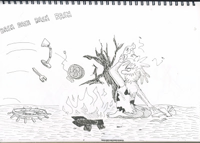
Above is the drawing I chose to explore further. I liked the idea of the hammer being the focus of a scene where primordial man and ape race to be the first species to become advanced. I then laid out a bit of a narrative which I'd like to storyboard.

Here are a few of those drawings.

The pattern on the floor was "inspired" (ripped off) from one of my favourite illustrators, David Shrigley.
Here it is seen in Shrigley's animation, "New Friends"


I kept the art style of the original drawing. I think the characters look nicely stylised. Were I to develop the drawings further I would make the background more detailed.


I've kept the hammer as the central object of the whole piece, but now that I'm building on that concept I'm keen to make it character based because it's more interesting. While I'm still sticking to the brief, I really want the focus to be on the competition between the neanderthal and the ape.

Thursday, 20 October 2016

Week Three: Storyboard Review Session (OUAN403)

This week was really useful because we got to critique and be critiqued on our storyboards from last week.

Here's some of the feedback that I received:


A very common criticism was that I didn't use many camera angles


To be fair, of the eighteen storyboard frames sixteen of them were only mid shots, so maybe a little diversity wouldn't have gone amiss.

I liked that it was visually pleasing. I tried to design the characters to look not too creepy.


This comment offered up a new perspective on my lack of diversity in shots, which was nice. This person liked the simplicity and stylistic choice.

Overall, my positive feedback was mostly stuff like:

  • It was lighthearted and humorous
  • It was aesthetically pleasing and clearly laid out
  • The story flowed well.
And my negative feedback was mostly stuff like:

  • I could've used a wider variety of shots
  • The shading is a little lacking
Some people said that they liked the detail while others said it wasn't detailed enough, but I guess you can't please everyone.

I understand what people mean when they suggest using a wide variety of shots to make it dynamic. I still defend my choice to use mostly mid shots because I couldn't see any need to add long shots or extreme close ups, which are used to isolate characters or intensify an emotional moment. In terms of keeping the storyboard looking dynamic, I'd prefer to do that by making the characters move in exaggerated and interesting ways and to make them compelling to watch rather than by adding frivolous camera angles.

The way the fiddlers move in unison, for instance
I agree that I should've added more shading to make the characters more indistinguishable from the backgrounds. I added a bit of shading before we displayed the storyboards, but it was more of an afterthought and I didn't really consider it enough.

Critiquing the work of others was a useful experience. Firstly, it forced me to think about the animation on another level and analyse in terms of what good shot framing looks like, and when it looks good to have the camera pan in to a scene or not. It was handy to consider these important details as I can apply it to my own practice.

Secondly, it was good to see other people's work so I can secretly see whether I'm better than them or not. I'm going to have to crush my classmates in the industry later anyway so it's good to know who'll be a threat to my media empire in the future.

(Only joking)

(Sort of)

Sunday, 16 October 2016

Week Two: Storyboarding (OUAN403)

This week's introduction to story boarding was a lot of fun. The most important lesson I took away was on how different types of shots can be used to tell the story in a more interesting way. For instance, close up shots are more intimate and emotionally intense, whereas long shots can make a character more isolated or can give a lot of context about where they are and what's happening around them. I also considered bird's eye views and worm's eye views, which give a subject a sense of either power or vulnerability.

It made me think about how I could tell a story much more dynamically and grab attention.

We made storyboards of a nursery rhyme of our choosing. I chose the one about "Old King Cole" who called for his pipe in the middle of the night and his three fiddlers. It seems to be a very innocent nursery rhyme, unlike others which have darker subtexts. "Ring a ring a roses" was a reference to the black death and "Mary, Mary, Quite Contrary" alluded to Mary the First's slaughtering of protestants. This rhyme doesn't even have much context. No one knows for sure who "Old King Cole" really was, but it's suspected that he could be one of three Anglo Saxon Kings from the third century. I didn't want to do anything subversive with this rhyme because I couldn't see any reason to, and I wanted to portray it's charm and innocence with the kind of older looking animation that one might see in the 1960s Scooby Doo show or the animated Charlie Brown cartoons.


The characters all move along a 2-D axis and the character designs and backgrounds are very simple and evidently hand drawn. I also emphasised this to give off the essence of characters drawn in a book, since they are from a nursery rhyme.


I ended up using mostly mid shots for this storyboard, which are great all purpose shots that clearly convey the characters' actions and are still close up enough to communicate their emotions through body language. I felt that the context of the rhyme didn't require the emotional intensity that would have justified using a close up. Were I to draw it again, I would have made the opening shot (shown above) a long shot to give the audience a sense of where the King is.


I used one close up, to emphasise that King Cole was whistling


My first rough copy, to work out where everything was meant to be.


Friday, 14 October 2016

Week One: Flipbooking And The Twelve Principles Of Animation (OUAN403)


We started our course by learning the twelve principles of animation, which we applied to flip books. I found that I kept going back to my notebook as I made the flip book to check up on how I should be applying each of the principles of animation to give the object energy and weight. I enjoyed animating simple stuff in the flip books like bouncing balls, but overall I found the fact that I couldn't see through more than one piece of paper at a time frustrating as it meant that key frames were hard to draw. Also, I got mad at the fact that my thumb kept getting stuck on one page which resulted in flipping half the book at once. I don't think that anyone in history has successfully flipped a flip book the whole way through.


I was pleased with my bouncing ball flip book, particularly the blue one. The sense of gravity in the red one is a little askew and the ball stays in the air for longer than it needs to.


This flipbook with the running man looks like absolute garbage. Firstly, his body doesn't move up and down when he is in mid stride. Only his legs do. Secondly, he stays in the air for far too long. Thirdly, the second part of the flipbook happens so quickly that no one can understand what's meant to be happening. This looked absolutely awful and I hate everything about it
.


I really enjoyed moving on to pencil test animations. It was incredibly satisfying to watch the line tests when I could properly see the twelve principles in practice.


I had to make quite a few tweaks and redraw quite a few frames, either because the squashing and stretching looked off or the object was moving too quickly or slowly.


A problem I encountered quite a bit was that the objects or characters would grow or shrink as I drifted off and lost track of what their dimensions were supposed to be, but I suppose that will improve with practice. Learning about timing has been really helpful and I tried to visualise exactly how many in-between frames would go between each key when doing the pencil tests. Again, I'm sure the knack for visualising it in my head will develop with practice.


Also, this jumping man's legs float to the ground way too slowly